Penguin SF cover art: Good, bad, rarely mediocre

John Wyndam’s classic has been dogged by the comical “horticultural horror” tag, as this Penguin Cover illustrates. This tag is a real disservice to what is one of the best end-of-the-world dystopian novels of the twentieth century. The cartoon on the cover shows the titular triffids as dumpy, hairy pineapples with a propensity to cluster together when visiting tourist attractions in central London. The long whip-like appendage has what appears to be a corn-on-the-cob at its end, and the odd tube-like stalk could perhaps double as a mouth or a trumpet.
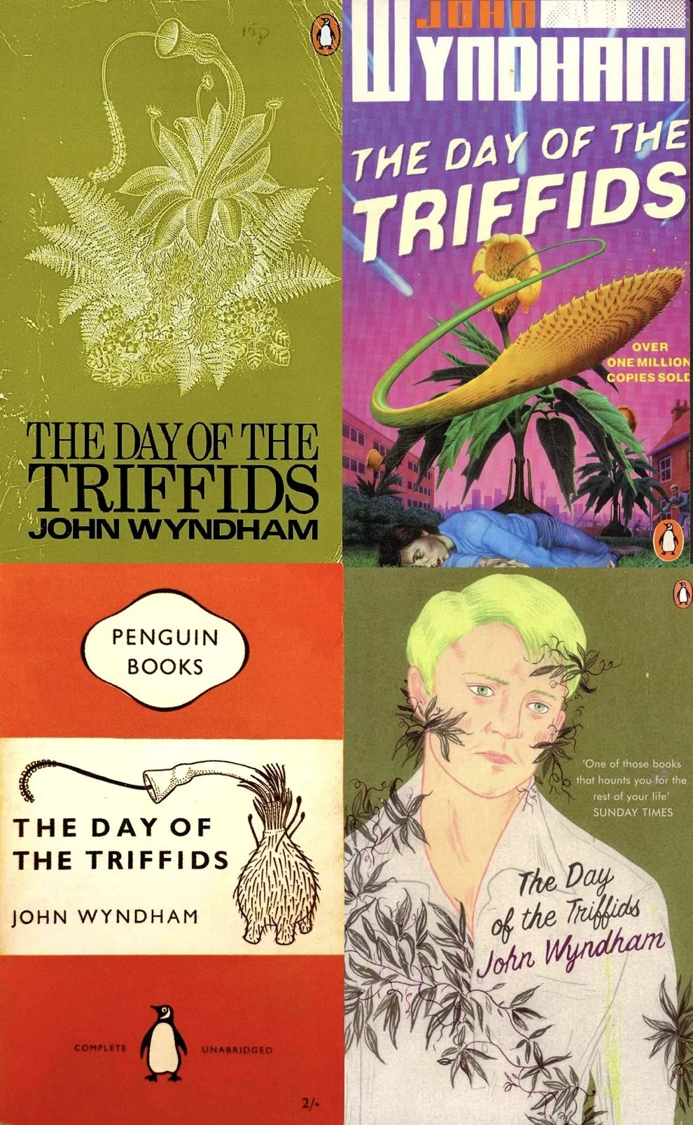
Designers have struggleded mightily to make the triffids menacing, and nine times out of ten have failed. As these four examples of failed Penguin covers testify. And this applies even more so to movie and TV adaptations of the story. They wobble, they lurch drunkenly, they appear about to topple over, and they look as dangerous as a raw turnip with stumpy legs. And yet…in the book they are terrifying. I await the invitation to make MY movie adaption of this classic book, to show eveyone how it should be done.

David Pelham switched from his bold airbrush and pseudo-diagrammatic styles to a highly minimalistic design based around spheres for the Fred Hoyle collection of books Penguin were publishing at the time. However, while there is a clever logic behind each illustration, they are not sufficiently visually arresting for the design to work as a whole. Instead they come across as bland and uninteresting.


The series of reversed line art illustrations for Wyndham’s Penguin editions always seems a peculiar choice to me. The illustrations are in several cases difficult to see (The Kraken Wakes) or covered up by the cover text (The Seeds of Time). The illustrations themselves are rather literal, flat, and uninteresting. And why reverse the black line art into white line art? I think the art director was trying cover up a bad job.


Ouch. This Kracken cover, and this series of Penguin covers in general must rate among the all-time worst covers Penguin has ever released for an adult author. Some of the others in the series are less offensive, such as that for The Midwich Cuckoos, but they are hard to love and cherish for those, such as myself, who were exposed to the Alan Aldridge and David Pelham Penguin covers of the 1960s and 1970s, although neither of those two designers illustrated any of Wyndham’s books, as far as I am aware.

The illustration for the Kracken cover is cringe-worthy, and the typography is eye-rollingly bad. BUT … the people at Penguin are not idiots (I assume). So, what were they trying to do with these covers? I think the answer is they were trying to appeal to the YA demographic. The covers are brash and eye-catching in a so-bad-they-are-good style, and I could see how they might suggest the stories inside are easily approachable, even for a younger audience (which they are). And if that was the goal, more power to Penguin’s elbow. (BTW, did it work, Penguin?)

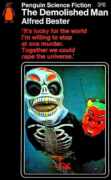
The Penguin lozenge covers are, I believe, an early attempt to bring a sense of identity to Penguin SF. The use of the distinctive black background emphasises the red/orange colofon, the “Penguin Science Fiction” banner, as well as the title of the work. The lozenge may also have been an expedient given the preference for photo illistrations. The photos themselves are a decidely mixed bag, although now they have a certain kitsch.