Classic science fiction and fantasy series invited the opportunity for classic book covers
Perhaps one of the most famous and well-loved series in all of science fiction, Asimov’s original Foundation trilogy has been expanded by the author at both ends with prequels and sequels. However, for me, it is the core three books that are the heart and soul of the series. I first encountered the books in their Panther editions with the stunning panoramic Chris Foss covers. Astonishingly, Chris was not a fan of science fiction and did not read the books he illustrated, hence his covers very rarely related to the stories he illustrated. Here, the familiar vast ships (and space station?) have the trade-mark harsh-lit hyper-detail, and awkward non-symmetry that emphasizes the sheer size of the objects he paints.


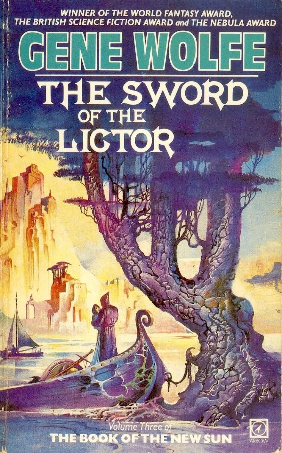
Discovering The Book of the New Sun by Gene Wolfe was a seminal moment in my science fictional journey. During my undergraduate studies, I had rather fallen out of love with sci-fi, having struggled with several uninteresting, poorly written books claimed to be of major import for the SF genre. I looked elsewhere for good writing and found it in Graham Greene. He transported me into the gritty and uncomprimising world of the 1940s-50s, in Brighton Rock, The Quiet American, The Power and the Glory, and The End of the Affaire, lit with sudden brilliant flashes of humor in Our Man in Havana and Travels With My Aunt. I also discovered the brilliant sand-paper and bile travelogues of Paul Theroux, and his strange metafictions, possibly about himself. But, while doing research in Oxford, I chanced across the first volume of Gene Wolfes’ master piece and suddenly my love of sci-fi was rekindled once more. I read these wonderful Arrow editions, fabulously illustrated with full wrap-around covers by Bruce Pennington, such that Severin has even been that hooded faceless figure climbing the Palatine Hill with the shockingly long Terminus Est slung over his shoulder, and the towers of the Citadel rising behind him into the storm-wracked sky.


Another famous trilogy of which I have only read the first volume thus far. I did not read this Simon & Schuster edition but it is surely a very handsome set of book covers. The artist is Kinoco Yamabe Craft, who was born in Japan and came to the US to continue her training as an artist. She has recently been focusing on fantasy book cover illustration. She has a rich, lush, and romantic style. Her covers here are somewhat different, having a vivid primitivist feel that certainly complements the world created in book one. She has won the World Fantasy Award for Best Artist award (2011) and has been nominated a number of times. You can learn more at her website here.


Bruce Pennington’s Dune Trilogy covers are iconic. As I have noted elsewhere, for me, he captures the tension between the almost medieval desert tradition of the Fremen and the high-tech sci-fi Universe they live in, with robed warriors set against spice crawlers and spaceships. He also captures the all-pervading sense of desert, with his trademark rivulets of windblown sand, and the parched and barren sandstone landscape of Arrackis. Most of all, though, he gets those blue-in-blue eyes of the spice-addicted perfectly. On the cover of Dune, the eyes of the Fremen warrior are exactly the same blue as the sky behind him, so that, if you stare for a while, you would swear you are staring through him into the horizon.


The cover design across the three books is also brilliantly executed. Firstly, using wrap-around covers gives the visual impression of complete immersion in the world portrayed in the illustrations, in the same way that the first three books completely immerse the reader in the world of Arrakis. Secondly, to have no text on the back cover is, from a marketing perspective, a courageous but correct one. Pennington’s illustrations do the job better than a thousand words. Thirdly, the strong bold, typeface — glowing white against the deep blues or greens of the Arrakis skies — gives a sense of weight to the title and author name, and each book emphasizes “DUNE”, emphasizing the close continuity of the first three books. Fourthly, the typography on the front cover is restrained, letting the illustrations do the talking.